Lettura: one screen, six states
If the app is one screen, the design work is not the layout, it is the six states that screen has to be in and the one it must never show.
The pitch says one screen. That makes the design question narrower and harder than a layout: which states does the one screen have, and which state is it forbidden to enter?
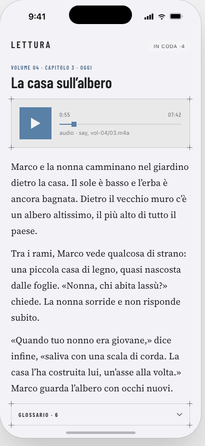
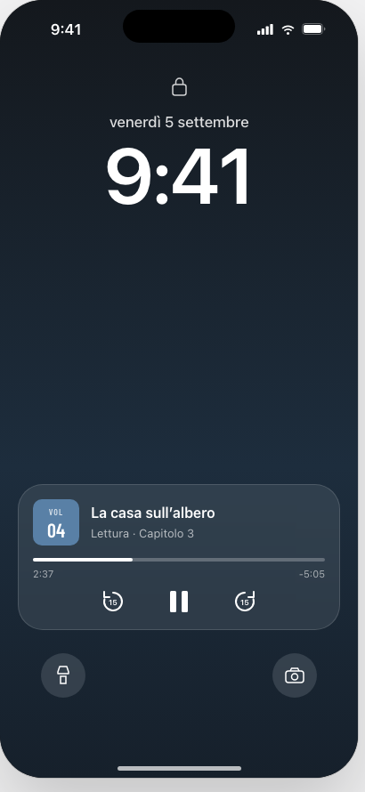
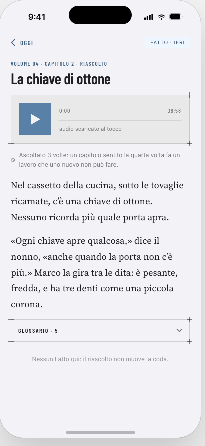
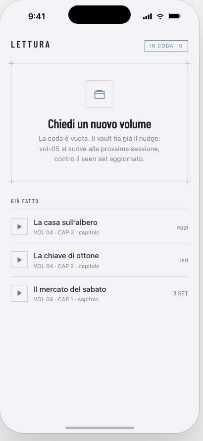
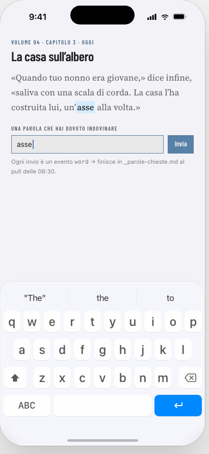
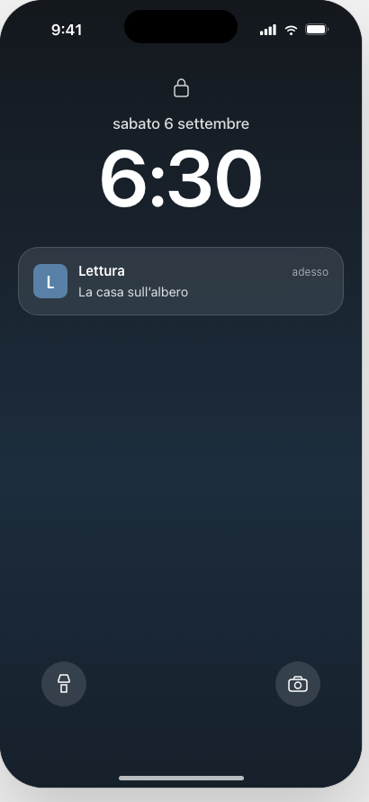
Three decisions these are arguing for.
Play is the hero. It is a solid accent plate and the only filled object on the screen. Everything else is an outline or a rule.
The chapter text is the one non-system voice. The chrome runs on a condensed industrial sans; the chapter itself is set in a serif, because it is being read rather than operated, and reading is a different posture from operating.
The queue count publishes, the next chapter does not. “Four in the queue” is useful: it says whether a writing session is due. Showing the next chapter would turn one obligation back into a backlog, which is what the email did.
The Italian here is placeholder, written to the same constraint the real chapters are: every word in it is one I already know, except the six in the glossary.
These were drawn as a live canvas and are published as still images, because the canvas compiles its device frame in the browser and this site’s content policy does not allow that. The pictures are the argument. The running version was only ever the drawing surface.
Get updates
Occasional notes on what's happening at Enginery. No spam, no marketing.